Keep it simple
Read Article
↓
↓
Less is more.
I'm always on the look out for great examples of simplicity.
Here’s a small selection of my favourites.
Less is more.
Keeping it simple 1940s style
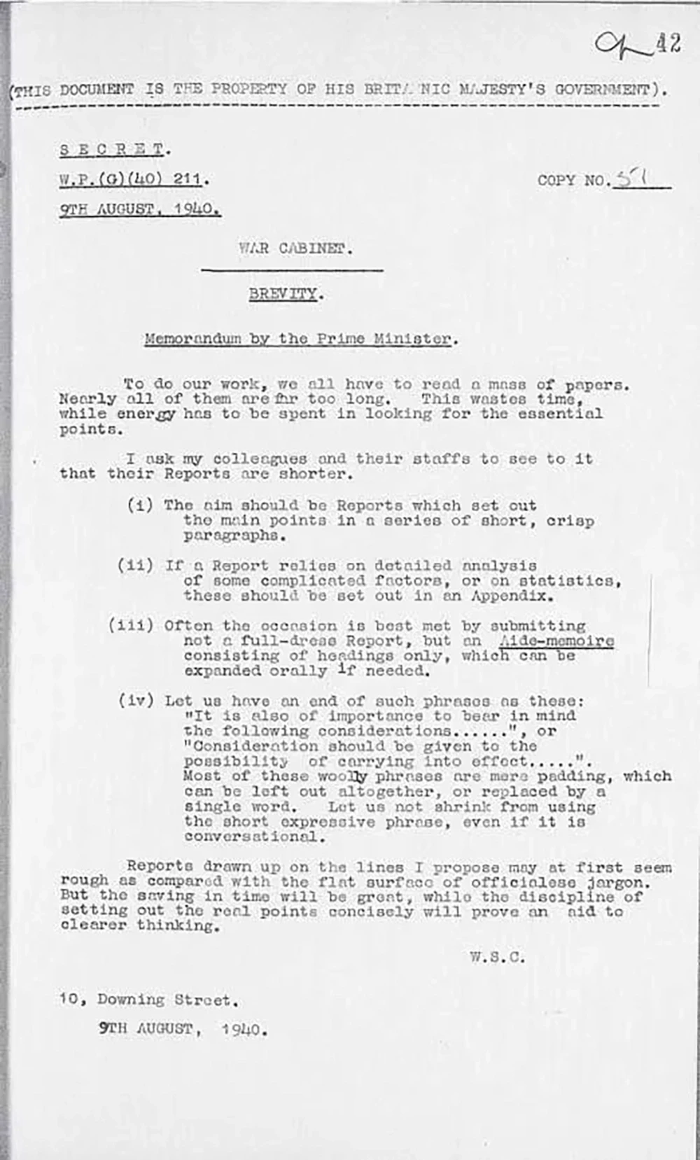
Here’s a war cabinet memo from 1940 from Winston Churchill requesting brevity.
He wants people reporting in to get to the point avoiding meaningless words and jargon.
I wonder how he’d have felt about PowerPoint?
Keeping it simple 1960’s style
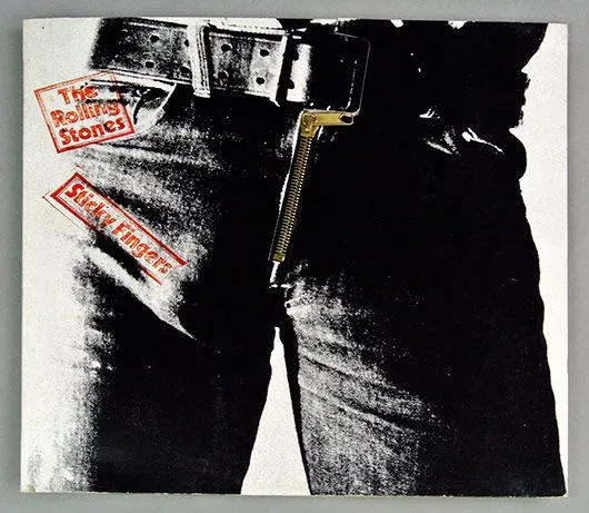
Here’s Mick Jagger briefing Andy Warhol on the cover design of their album, Sticky Fingers.
My favourite line “…and please write back saying how much money you would like”.
The best brief ever?
Try reading it out loud in your best Mick Jagger voice.

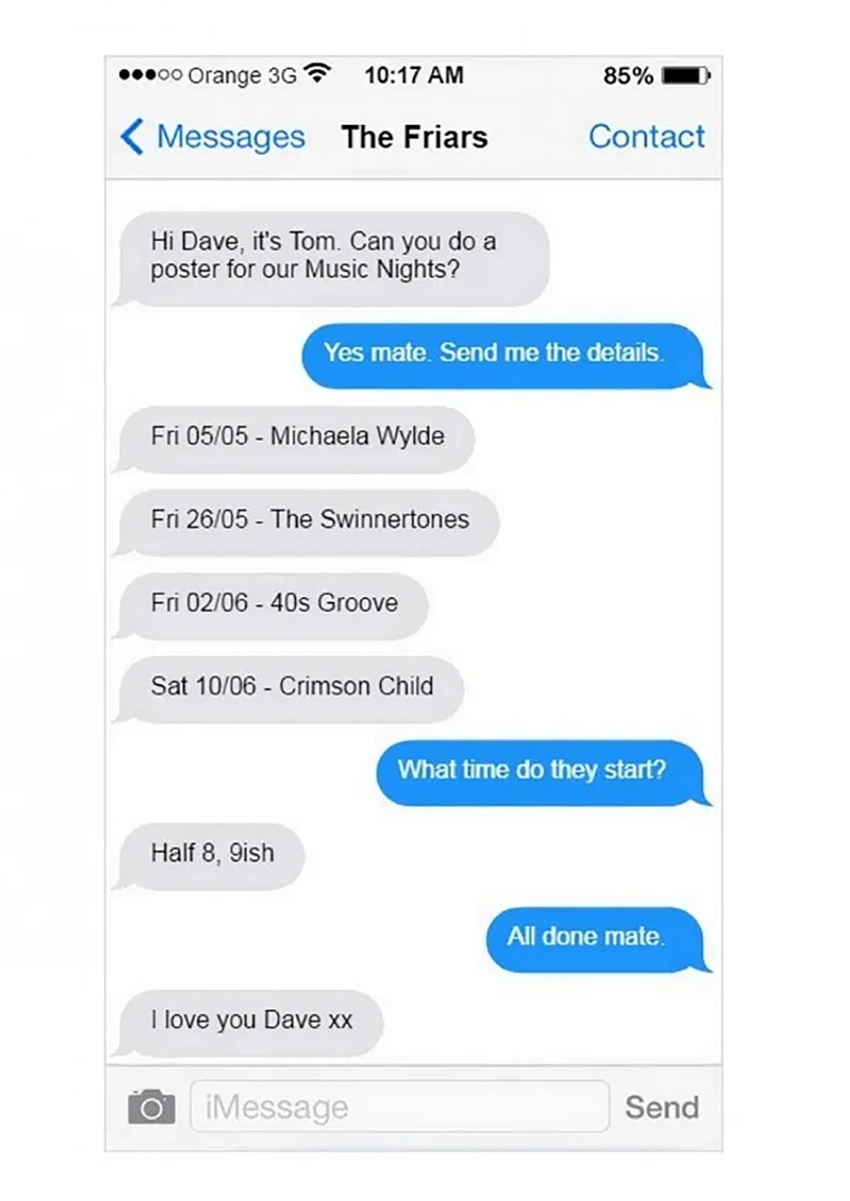
Keeping it simple 2020's style
This poster went viral, and it turns out that Tom Hughes, who runs The Friars, admitted that this wasn’t a real text exchange, but was his own concept.
It turns out that Tom doesn’t even own a smartphone — he has a Nokia C2 and he created the ad using Photoshop and an online text generator.
I’m going to gloss over that and pretend that it’s just a screenshot of a few texts between Tom and his designer Dave.
Nice one, Dave.
Nice bit of viral marketing, Tom.
SHARE ARTICLE


